Reading Mini Program Analytics: The Numbers That Mean Something
The backend gives a small operator far more numbers than it gives them signal. Most of the dashboard is noise at your volume, and one number is worth the whole rest of it.
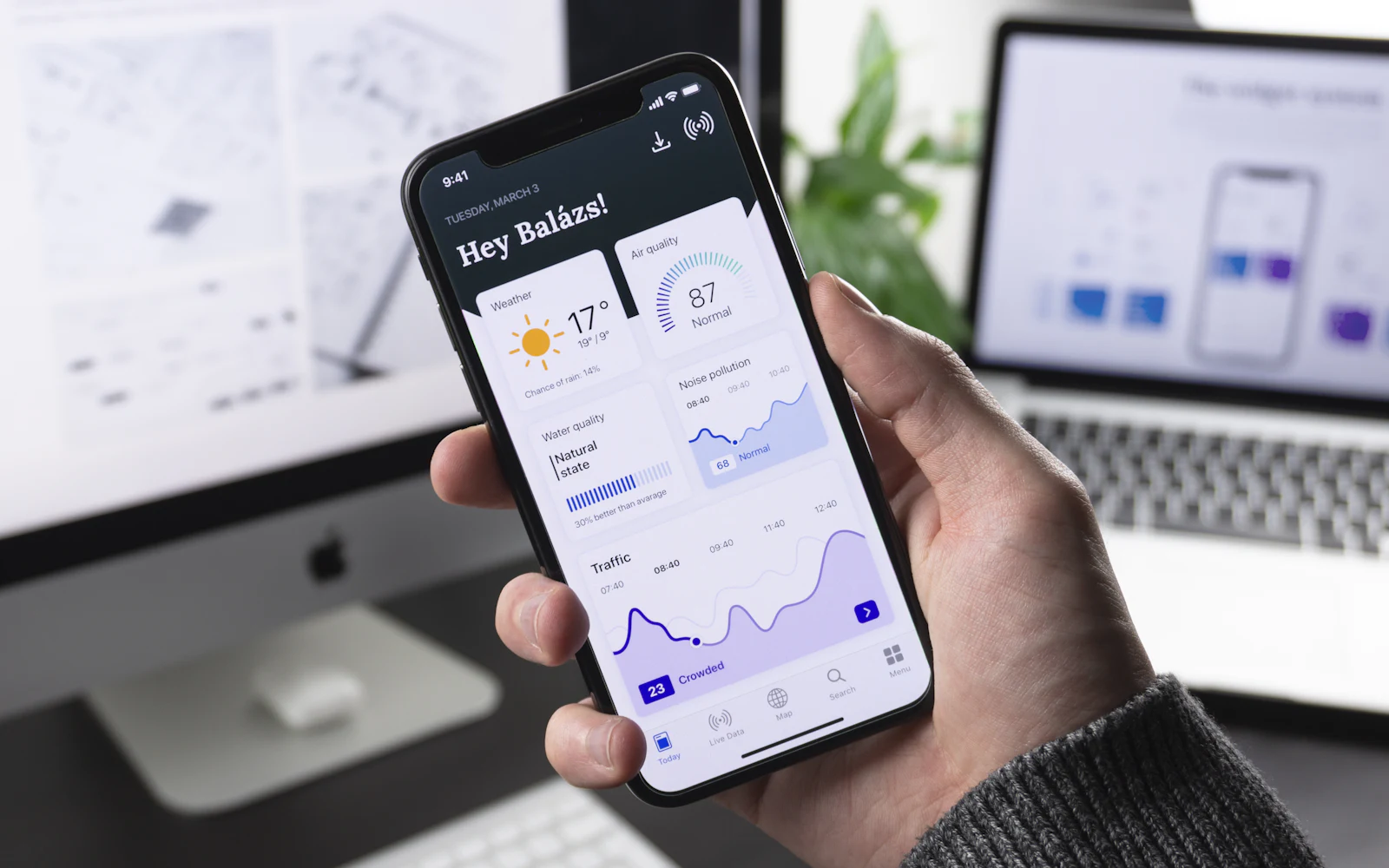
The analytics behind a Mini Program are built for businesses with a great deal more traffic than yours. That is not a criticism of the tooling; it is the reason most small operators either ignore the dashboard completely or, worse, read it every Monday and make decisions from movements that are pure noise.
This post is about which numbers survive contact with a small operator's volume, and which ones are actively misleading at that scale.
The short version: at a few hundred visits a month, week-on-week changes tell you nothing — the variation is larger than any effect you could cause. Two things are worth your attention: where visitors arrive from, and the drop between the product page and the enquiry. Look at both over a season rather than a week. Retention and repeat-visit metrics are borrowed from e-commerce and mostly do not apply to a business somebody buys from once.
First, the arithmetic that governs everything else
Suppose you get forty visits a week and three enquiries. Next week you get five. On paper that is a 67% improvement. In practice it is two extra people, and at those counts two extra people is what an ordinary week looks like.
This is the single most useful thing to internalize, because almost every mistake made with this dashboard follows from ignoring it. Small numbers move a lot on their own. A change you can act on has to be bigger than the week-to-week wobble, and at your volume that means comparing months or seasons, not weeks.
The practical rule: if you cannot state the number of extra people involved, you are looking at a percentage that means nothing.
Where visitors came from
This is the most useful panel on the dashboard, because it tells you which of your efforts is doing anything.
The platform reports entry sources in its own categories, and what you are looking for is the split between people who searched, people who arrived from something shared to them, and people who scanned a code. Those three correspond to the three discovery routes we walked through in how a Mini Program gets found — the mechanics are there, and what the dashboard adds is which of them is actually happening for you.
Read it as a diagnosis rather than a score:
- Almost all scans, almost no search. Your Mini Program works as a receipt for people who already met you. Nothing wrong with that, but it is not reaching anybody new.
- Shares outweigh everything. Somebody is forwarding you into group chats, which is the strongest signal on this list and the one worth investigating — find out who.
- Search is a real share of arrivals, and enquiries did not move with it. People are finding you and not recognizing what they found, which is usually a first-screen problem rather than a traffic problem.
The one number that changes what you do
Of everything on the dashboard, this is the number worth building a habit around: of the people who reached a product page, how many started an enquiry or a booking.
Everything upstream of that is traffic, and traffic is somebody else's decision. That step is yours. It is decided by what is on the page — whether the price structure is legible, whether the questions a traveler actually has are answered, whether the enquiry asks for four fields or fourteen. Those are things you control and can change on a Tuesday.
If that ratio is bad, the fix is on the page, not in the marketing. The specifics of what belongs on a product page are in the anatomy of a storefront.
Numbers to stop looking at
Cumulative users. It only goes up. A number that cannot fall carries no information.
Total visits, on their own. Without a source split and without the enquiry step, a visit count tells you that something happened somewhere.
Retention and repeat visits. These are the heart of an e-commerce dashboard and largely irrelevant to a tour operator, because your customer is visiting your city once. Chasing a retention figure for a business people buy from once in their life is optimizing for a thing you do not sell. The exception is a product people buy more than once — a transfer service, a restaurant in a city with a lot of returning business travelers — and if that is you, then this metric is real.
Time on page, in most cases. It cannot distinguish careful reading from a phone put down mid-scroll.
Look at it seasonally
Given the arithmetic above, the useful rhythm is not weekly. Once a month is enough to notice a real change, and once a season is when the comparison becomes meaningful, because your own demand is seasonal and last April is a fairer comparison than last week.
What you are looking for across that span is direction and composition: is the source mix changing, is the enquiry step improving, did the thing you changed in March show up by June. A small operator who looks four times a year and acts on what they see is ahead of one who looks every Monday and reacts to noise.
What the dashboard will not tell you
Three real limits, worth knowing before you go looking for answers that are not in there.
Why anybody left. The dashboard records that they did. The reason is not a data question; it is answered by watching somebody unfamiliar use the thing, or by reading what people ask in chat before they book.
Who they are. You will not get a picture of an individual traveler out of this, and the data-protection habits around what you do collect are a separate matter, sketched in compliance basics.
Whether your marketing worked. A visitor who saw a Xiaohongshu note in March, searched your name in May and booked in June is not traceable to the note by anything in here. Attribution across Chinese channels is genuinely broken rather than merely difficult, and it deserves its own post rather than a paragraph in this one.
Where CN1X fits
If we build or run a Mini Program for you, this is the part of the reporting we think is worth your time: the source split, the enquiry step, and a plain-language note on what changed and what we think it means. Not a dashboard screenshot with everything on it.
We don't promise traffic and we don't report numbers as achievements — where a number moved because the season moved, we'll say so. Almost nobody can tell whether their own figures are good, because there is no published baseline to compare against. Show us what you're seeing and we'll name the two numbers worth a look and the rest you can close.
More from the blog

Korean and Japanese Operators Selling into China
A short flight changes the customer. What long-haul advice gets wrong for operators in Korea and Japan, and which barriers you have already cleared.
What a Month of Running the Account Actually Looks Like
"What is the ongoing commitment" is really a question about calendars. Where the hours land, who they land on, and which parts cannot be batched.

What You Supply Before a Mini Program Build Starts
The quote is signed and then three weeks pass with nothing visible happening. Almost always the build is waiting on things only you can hand over.