The Anatomy of a Mini Program Storefront Built to Convert
A WeChat Mini Program storefront is not a shrunken website. The screens, trust signals and zero-typing checkout that turn Chinese interest into bookings.
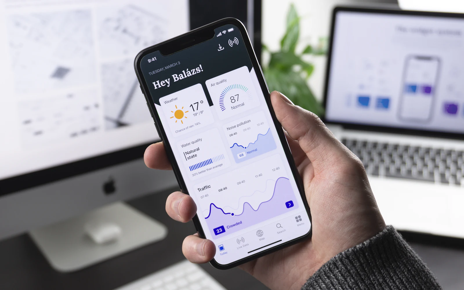
Most of the work of winning Chinese customers happens before anyone sees your storefront — the seeding, the search rankings, the QR codes on counters. But every one of those channels delivers people to the same handful of screens, and those screens decide whether interest becomes a booking. When overseas brands build their first WeChat Mini Program, the costliest mistake is rarely technical. It's structural: they port their website — same menu, same pages, same checkout logic — into a container that gets used completely differently. A storefront that converts is organized around three realities: visitors arrive sideways, trust is audited rather than granted, and nobody wants to type.
The short version: a Mini Program storefront built to convert treats every screen as a landing page (because share cards and QR codes skip your homepage), assembles trust the way Chinese consumers actually check for it, pre-answers the questions a buyer would otherwise ask in chat, and reaches a paid booking without asking anyone to create an account or type more than what the service genuinely needs.
Every screen is a landing page
On the open web, you can mostly assume a visitor enters through the front: homepage, then category, then product. Inside WeChat the geometry is different. A share card dropped into a family group chat opens one specific tour. A QR code on a partner's counter opens a booking page. A WeChat search result opens whatever screen matched the query. Sessions commonly start in the middle of your storefront, not at its entrance.
That changes the job of every page. A product page can't just describe the product; it has to carry a stranger's first impression — who this brand is, whether it's real, what the thing costs, and what to tap next — without assuming anything came before. The practical test is simple: open any screen cold, as if you'd never heard of the brand, and ask whether you could get from there to a confident booking without backing out to check who these people are.
The first screen decides
When visitors do open the storefront at its entrance, the first screen has one job, and it isn't "showcase the brand." It's orientation: what you sell, for whom, and what to do next — visible without scrolling, in Chinese written for buyers rather than translated at them.
The bar here is set by habit. Your Chinese customer's sense of "normal" comes from the Mini Programs they use every day — coffee chains, airlines, hotel groups — and those are ruthlessly task-first. Against that reference point, a brand-film hero section or a forced sign-up doesn't read as premium; it reads as friction. Sign-up is the classic own-goal: WeChat identifies the user anyway, so there is almost never a reason to demand anything before checkout.
Two structural habits do most of the work: a single plain promise line at the top — the sentence you'd say out loud to a customer — and category paths short enough that any product sits within about two taps. If the first screen needs a carousel to cover everything you do, the storefront is carrying too much.
Trust is assembled, not claimed
Western product pages claim trust — a Trustpilot score, a wall of press logos. Chinese consumers tend to audit it, and they look for specific artifacts. We've written a fuller guide to what replaces reviews and star ratings; inside a storefront, the short list looks like this: the verified entity name behind the Mini Program (users can check it, and the cautious ones do), photography that is unmistakably yours rather than stock, a human customer-service entry that answers in Chinese, and refund and cancellation terms stated before payment rather than discovered after it.
For service businesses, specifics carry the weight: the actual vehicle, the actual guide, the actual meeting point. It's the difference between "trust us" and "here is everything you'd want to verify." That's the anatomy behind the storefront we built with Kiwi Driver Tours & Transfers — now live on WeChat — where the storefront's job is to make a small New Zealand operator feel as checkable as a big platform listing.
Product pages that pre-answer the chat
A behavioral difference shapes the whole page: a Chinese buyer who is nearly convinced doesn't quietly re-read your FAQ — they open the chat and ask. Every question that reaches your inbox is real demand, but it's also friction and staffing cost. A page that pre-answers the predictable questions converts the cautious reader and shrinks the queue.
For a tour or service product, the questions are stable enough to design against:
| The buyer is wondering | The page should show |
|---|---|
| Is this exactly what I think it is? | What's included and what isn't, item by item |
| Will it work for us? | Group size, kids and luggage, language of service |
| What if plans change? | Cancellation and refund terms, in plain words |
| How do we meet? | Pickup or meeting point, shown on a map, not just an address |
| Can I ask something first? | A visible chat entry on the product page itself |
Photos lead, specifics follow, policy sits above the pay button. And the chat entry stays visible anyway — the goal is that when someone does ask, it's a buying question, not a basic one.
A checkout with nothing to type
Checkout is where a Mini Program either cashes in its structural advantage or throws it away. The advantage: WeChat already knows who the user is, so there is no account to create and no password to invent, and a phone number arrives through a one-tap authorization instead of typing. A well-built flow asks only for what the service genuinely needs — for most tours: contact, date, party size, pickup — and puts the native WeChat Pay sheet one tap after them.
The mistakes are typically imports from web checkouts: address fields when nothing ships, an email field nobody will read, "create an account to track your order" logic when WeChat is the account. Each borrowed field typically costs completions and adds nothing.
For higher-value bookings, the pattern worth designing early is deposit-and-balance: a smaller payment secures the date, the remainder settles closer to the service. It fits how considered travel purchases are commonly made, it lowers the psychological bar of paying an overseas stranger — and the storefront just has to present it plainly: what's paid now, what's due when.
After payment: the quiet second storefront
The booking isn't the end of the anatomy. A confirmation and a reminder arriving as WeChat service notifications; an order page the customer can reopen from their recently-used Mini Programs; a chat thread where you can send day-of details — that's the part of the storefront your repeat business and referrals ride on. The share card that delivered this customer can be passed onward with one tap, and a satisfied recommendation in a group chat is commonly how the next customer arrives.
None of this needs to be elaborate at launch. It needs to exist — and ported-website builds commonly skip it entirely, because websites never had it.
What to leave out
Anatomy is also about what's not there. The strongest first storefronts are small: one screen of orientation, a compact catalogue, product pages that answer everything, a checkout with nothing to type, an order page that keeps working after payment. They leave out the About-page essays, the video headers, the English-only fallbacks, the forced sign-ups, and the links out to web forms that break the payment context.
Small keeps WeChat's review process simple and load times fast — and, more commercially, it keeps every path pointed at the same place: a booking. Scope you can always add later. A first impression you can't.
Where CN1X fits
This anatomy is what we design and build: a WeChat Mini Program storefront with the trust artifacts in place, checkout wired to WeChat Pay and the post-payment loop ready — the storefront layer of the full channel we operate. A focused build typically launches in 2–4 weeks once accounts are in place. If you have something Chinese customers should be booking, walk us through it and we'll sketch the screens it deserves.
More from the blog

Korean and Japanese Operators Selling into China
A short flight changes the customer. What long-haul advice gets wrong for operators in Korea and Japan, and which barriers you have already cleared.
What a Month of Running the Account Actually Looks Like
"What is the ongoing commitment" is really a question about calendars. Where the hours land, who they land on, and which parts cannot be batched.

What You Supply Before a Mini Program Build Starts
The quote is signed and then three weeks pass with nothing visible happening. Almost always the build is waiting on things only you can hand over.